
Background
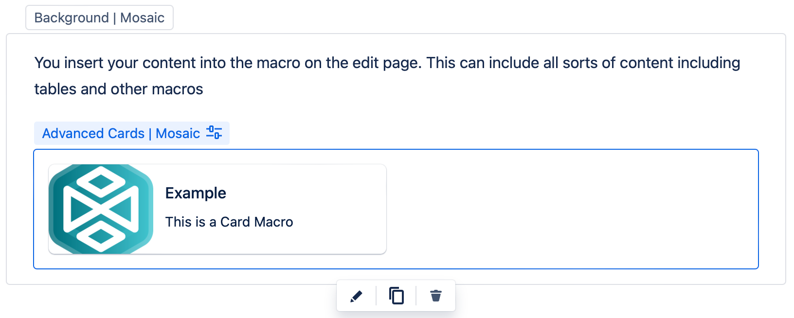
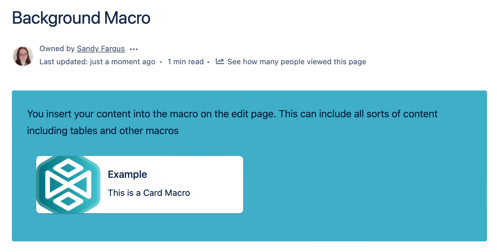
Background is a macro that allows you to easily add a background of your choice to your page. You can add multiple Background macros to your page as a way to segment the information you are presenting. It's a great tool to engage your audience by combining images and color to attract attention to key information, enhance your brand identity, and break up content into easily digestible chunks.
Add a Background macro to your page
- Navigate to the page you want to edit.
- Click the Edit icon.
- Click Insert > View More.
- Select the Background macro in the Browse screen.
Customize your background. Changes you make will be shown in the dynamic preview of the editor.
- Click Insert. A macro placeholder is displayed.
- Insert the content you want inside the macro.
- Click Publish to see the Background macro in action.
Customize your Background macro
There are lots of ways to customize your Background macro to highlight your content in just the right way.
Select a color
Using the color palettes you can change the background and text color of your alert. The background color is found at the top of the Background Fill section. The text color is a little further down in the Content section.
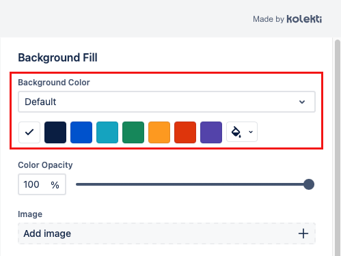
You can use one of the options from the color palettes or select your own color. You access this by clicking on the paint bucket icon. This will open a color picker nearby.
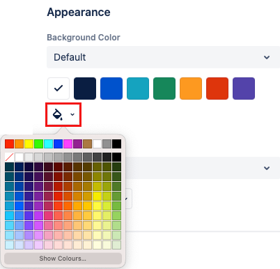
Change the color palette
Changing the color palette will change the presented options for Background Color and Text Color.
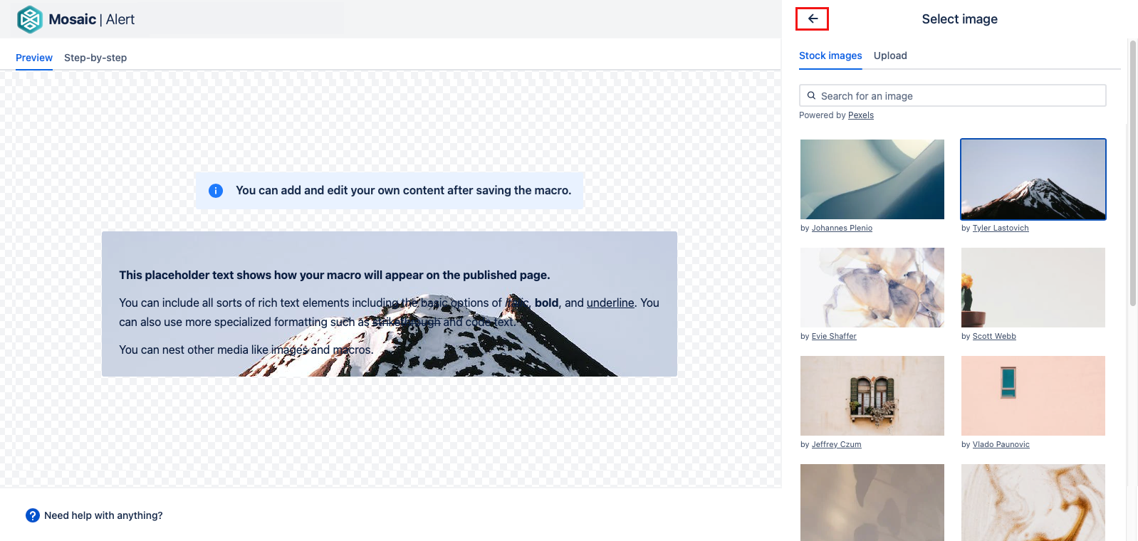
Add an image
Images that are inserted inside the macro on the edit page are part of the foreground. They will not be affected by the image parameters of the macro. For an image to be part of the background, you must choose it through the macro editor.
There are two ways to add an image to your alerts. Both can be found by selecting the Add Image button.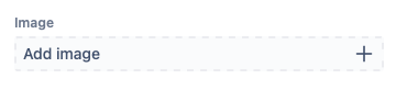
a) Stock image. This option allows you to search for an image from our free image library. Simply select an image and check the preview to see how it looks on your background. When you are happy with the image, select the back button.
a) Upload. This option allows you to add your own image. You can drag and drop an image file into the macro window or click Upload image to select an image file from your local file storage.
Once you have selected your image, an image cropper displays to allow you to refine the size and section of the image.
- To reposition the image area, drag it to the desired position. You may need to scroll to display the desired area if your image is large.
- To resize the image, click a corner and drag it until the area is the desired size. The fixed-ratio image size can have a maximum height or width of 300 pixels.
Accepted image formats: JPEG, PNG, GIF, ICO BMP, and WEBP
Maximum file size: 15 MB
Change the size of the image
There are three options for the size of the image:
- Original Size
- Resize to fit into the container - the size of the image will be changed so that the whole image can be seen.
- Resize to fill the container - the size of the image will be changed so that there is no blank space, so some of the image may not be visible.
Change the position of the image
You can choose a position for your image from the Image Position dropdown. Using these options you can choose where in the background container the image is lined up to.
Change or remove an image
To change an image select the pencil icon next to the image name. Then add an image as before.
To remove the image select the trash can icon.

Change the opacity of the color or image
You can change how opaque the background color or image is using the opacity sliders. You can choose a position on the slider, or type in a number. Using this setting allows you to combine color and image to make your perfect background.
Change the background container
Changing the container affects the shape and size of the background on the view page. Using these settings, you can fine-tune the appearance of the background or create several similarly sized backgrounds to fit in a layout.
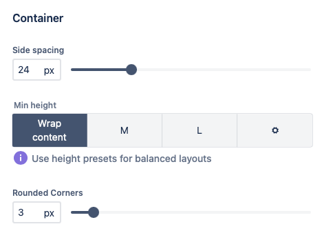
Change the padding of the text inside the background
The Side spacing slider allows you to change the distance between where the content starts and ends and the outside of the background area. This is a little like changing the thickness of the 'frame' around the text. This can let you position your content better inside a background.
The padding can be between 0px and 100px.
Change the height of the background
There are four options for the height of the background. All of the options are for the minimum height of the background. If the content needs more height the background will expand to fit it. This can make the backgrounds look a little different on different screen sizes.
- Wrap content - the background height will grow or shrink to fit the content.
- M - the background is 300px high.
- L - the background is 500px high.
- Custom - use the slider to set the minimum background height in pixels.
If you are using backgrounds in a layout and want them all to be the same size. Using a preset or custom height can be a good way to acheive this. If you leave a little bit of extra space at the bottom they should remain the same size on most screens.
Change the corners
You can use the Rounded Corner slider to change the shape of the corners.
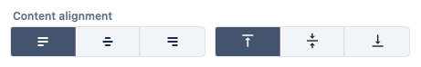
Change the content alignment
You can change the alignment of the content inside the background using the alignment buttons.
The buttons on the left allow you to set the horizontal alignment. The options are left, centre, and right.
The buttons on the right allow you to set the vertical alignment. The options are top, centre, and right.
Edit your Background macro
To make changes to a Background macro after it is published, first display the page in Edit mode.
- Click the background macro, then click the Edit icon.
- Make your desired changes, then click Save.
Remove a Background macro
To remove a Background after it is published, first display the page in Edit mode.
- To keep the content, first copy it and paste it outside the macro.
- Click the background, then click the Trash icon.
Put Other Macros Inside
It is possible to put other macros inside this one. Some larger or more complex macros may not work, or work differently than expected.
When trying to figure out which marcos can be put inside others there it helps to identify the type of macro you are working with. There are two general types of macro:-
Rich Body Macros -There are macros that you can type in on the Confluence Edit page
Simple Macros - These are macros that you can not add anything to on the edit page, you can only affect them by opening them in the editor.
Typically Rich Body Macros, do not work as expected, or at all when put inside other Rich Body Macros.
Most, but not all Simple macros can be put inside a Rich Body Macro, and often work as expected.
See below for more information on what happens when you put various macros inside this macro.
| Macro | Works As Normal | Notes |
|---|---|---|
| Alert Macro |
| The alert will display each time that the macro holding it is opened. |
| Button Macro |
| |
| Button Group |
| This type of macro will not fit inside another macro. |
| BibTeX Reference Macro |
| References within tabs will only display in a Summary Macro in the same tab. |
| BibTeX Summary Macro |
| The Summary Macro will only list BibTeX references within the same tab. |
| ||
| Footnote Macro |
| Footnotes within tabs will only display in a Summary Macro in the same tab. |
| Footnote Summary Macro |
| The Summary Macro will only list Footnote references within the same tab. |
| LaTeX Macro |
| |
| Progress Bar Macro |
| Works as long as there is only one progress bar on a page. If there are multiple nested progress bars on a single page it can cause a failure. |
| Round Rectangle Macro |
| This type of macro will not fit inside another macro. |
| Tabs Macro |
| This type of macro will not fit inside another macro. |
| Tooltip Macro |
|
| Macro | Works As Normal | Notes |
|---|---|---|
| Action Item |
| You can add the macro, but it doesn't keep it's status while in the tab. |
| Attachments |
| This macro displays the attachements on the page. However the drag and drop upload function does not work. |
| Blog Posts |
| |
| Bullet List |
| |
| Code Snippet |
| |
| Contributors |
| |
| Contributors Summary |
| |
| Chart |
| This type of macro will not fit inside another macro. |
| Change History |
| |
| Children Display |
| |
| Content by Label |
| |
| Content Report Table |
| |
| Create From Template |
| |
| Date |
| |
| Decision |
| |
| Decision Report |
| |
| Emojis |
| |
| Error Panel |
| |
| Excerpt |
| This type of macro will not fit inside another macro. |
| Excerpt Include |  | |
| Expand |
| If you wish to use this macro you can put it in the cell of a table, inside the macro. |
| Files and Images |
| |
| Gallery |
| |
| Iframes |
| |
| Include Page |
| |
| Info Panel |
| |
| Jira Charts |
| |
| Jira Issues |
| |
| Jira Legacy |
| |
| Jira Roadmap |
| Only displays a link. |
| Layouts |
| This type of macro will not fit inside another macro. |
| Labels List |
| |
| Link |
| Links can be added and work, however the smart link options do not work as expected. eg. you can't use Card View, Embed View or Inline View, you can only show the url. |
| Mention |
| |
| Note Panel |
| |
| Numbered List |
| |
| Opsgenie Incident Timeline |
| |
| Page Index |
| |
| Page Properties |
| This type of macro will not fit inside another macro. |
| Page Properties Report |
| This macro works as normal except when the table contains any other macros. |
| Page Tree |
| |
| Page Tree Search |
| |
| Popular Labels |
| |
| Profile Picture |
| |
| Related Labels |
| |
| Recently Updated |
| |
| Recently Updated Dashboard |
| |
| Roadmap Planner |
| The roadmap displays, but the links do not display when you hover over the bars. |
| Shared Links Bookmark |
| |
| Spaces List |
| |
| Status |
| |
| Success Panel |
| |
| Table |
| |
| Table of Contents |
| |
| Table of Content Zone |
| This type of macro will not fit inside another macro. |
| Task Report |
| If you have enough tasks to result in multiple pages of tasks, you may not be able to scroll through the pages. |
| Team Calendars |
| |
| Trello Card |
| |
| Trello Board |
| Although the board will display in edit mode, it does not display in view mode. |
| User Profile |
| |
| Warning Panel |
| |
| Widget Connector |
|