
Card
This is the documentation for the old version
For information about the latest version of this macro, see Advanced Cards.
This information is correct if you edit an old card macro. You can tell you are using the old version of the card macro by looking at the preview in the editor; only a single card will be shown, with no option to add more.
FAQs about the change
Q. Can I convert my old cards to the new editor?
A. Advanced Cards is a whole new macro with no migration path to convert from the old Card macro. You can still edit your old Card macros; they still look and act like you expect.
Q. Can I still add the old Card macro to a page?
A. The Advanced Cards macro can do everything the old macro did. So, to add a new card to a page, you need to use the new Advanced Cards macro.
Q. What if I only want one card?
A. Even though it’s called the Advanced Cards macro, you can still make a single card. Delete the cards you don’t need. In the preview area, hover over the card you want to remove and then select the trash icon.
Increase user engagement by adding this clickable navigation element to call out important links to content or to add visual interest to a homepage index. If you want to use multiple cards together, for example, in a grid or list pattern, these can be arranged horizontally or vertically according to your page setup. Customizing the card with statement images and contrasting color schemes adds instant appeal to your Confluence page.
Add a Card macro to your page
To add one or more cards, complete the following steps:
Navigate to the page you would like to edit.
Click the Edit icon in the top-right of the page, or simply press `
e` on your keyboard to display the page in Edit mode.Click the position where you want to display your card.
Select Insert > View More in the Confluence editor.
Select the Card macro in the Select Macro screen.
Customize your card by completing the card parameters. The dynamic preview allows you to instantly view any changes you make to the card before inserting it.
Style This option determines the orientation of the card along with the position of the card image. See Examples for inspiration.
Horizontal (default): card image is positioned above the title and body text
Vertical: card image is positioned to the left of the title and body text
Simple: card is displayed without an image area; the title appears above the body text

You can create a horizontal card without an image using the Simple option. Title Type the desired header or label of your card. It is a fixed size, bold font. Maximum character length is 50 characters Body Type the card content or description. Maximum character length is 255 characters Select Image Selecting this button will give you two options; Upload or Stock image. Once you have selected your image, use the left arrow to return to the main editor.
a) Upload. This option allows you to add your own image. You can drag and drop an image file into the macro window or click Upload image to select an image file from your local file storage.
Once you have selected your image, an image cropper displays to allow you to refine the size and section of the image. See Resizing images.b) Stock image. This option allows you to search for an image from our free image library. Simply select the image you want to see how it will look on your card.

Accepted image formats: JPEG, PNG, GIF, ICO BMP, and WEBP
Maximum file size: 15 MB
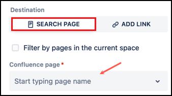
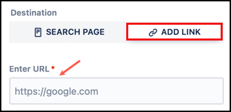
Destination Using these controls, you can choose where the button will send people. There are two main options:
Link to a Confluence page on your site
Select Search Page, then type in the Confluence page field. The field will search for matching Confluence pages, which you can then select from the drop-down. To only see pages from the same space select the check box above the search box.
Link to a URL
Select Add Link, then type the full web address in the Enter URL field.
If you use the page or URL option, the entire card will be clickable; if you do not add a link, it will be a static card.
Color Palettes Changing the color palette will change the presented options for Background Color and Text Color.
The options are:-
Default - The options are a standard selection of colors that do not change. There are different options for the background and text colors.Recently used - The options offered will be the last seven colors you have used in any of our macros.
Local Space - The options offered in this palette are specific to the space. The Space Admin can create and edit this palette. This may be used for your team's colors of choice.
Organization - This palette offers the same options in every space. Confluence Admins can create and edit this palette. This may be used for your organization's brand colors.
If you have not yet saved a macro, there will be no color options in the recently used palette. Background Color Choose the background color for the card.
You can select from one of the options shown. If you don't see the color you want, select the Paint bucket button: to open a color picker and choose any color.The appearance of the color picker will depend on which browser you are using.
Text Color Choose the text color for the card.
You can select from one of the options shown. If you don't see the color you want, select the Paint bucket button: to open a color picker and choose any color.The appearance of the color picker will depend on which browser you are using. - Click Save. The card preview displays.
- Click Publish.
- If your card is clickable, remember to test the defined link destination.
- If adding more cards, complete the steps above.
Edit a Card macro
To make changes to a card after it is published, first display the page in Edit mode.
- Click the card, then click the Edit icon.
- Make your desired changes, then click Save. If you want to edit a card image, you must upload it again.
Remove a Card macro
To remove a card after it is published, first display the page in Edit mode.
- Click the card, then click the Trash icon.
Examples
Limitations
Due to Atlassian limitations, there are a couple of things that do not behave as you might expect:
- Copy-paste: copying and pasting Card macros that contain image attachments results in the same image ID being assigned to all card copies.
So, if you copy a card and then later change the image in that first card, the same image will be shown in all the cards you made by copying that first card. - Google Chrome Incognito mode: card image attachments do not render if Confluence is opened in a Chrome Incognito tab.
Video Walkthrough
Watch our video walkthrough to see the Card macro in action.