[All Adaptavist Apps]
This information is for ThemeBuilder on Confluence 4 or lower. Go to the documentation for ThemeBuilder on Confluence 5+
Menus Tab
This tab is accessed from the Layout Manager in Theme Builder 3.0 and above.
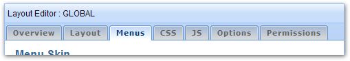
The Menus tab allows you to customise the design and functionality of menu-based navigation within the layout...
Menu Skin
This option lets you set the design used for the menus:
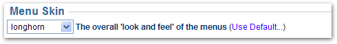
There are a number of styles to choose from as shown below:
need to add gallery
Note: To set the text, background and borders of the horizontal menu bar when used in the Menu panel, use the Panel Editor.
Custom Styles
Some of the available styles are designed to allow greater customisation of menu styles through CSS and should only be used if you intend developing a custom menu style:
- Custom – Just enough CSS to make the menus usable, however you'll need to specify your own background colours as a minimum.
- Custom 2D – An extension to the Custom option, this provides a small amount of extra CSS for 2D menus.
- Custom 3D – Similar to Custom 2D, but provides some additional CSS to help with 3D effect menus.
- None – No menu style will be output - you should only use this option if you are prepared to create custom menu styles from scratch, or if you are not using menus within your wiki.
For more information on customising the menu style with your own style sheets, see our tutorial on Customising Menu Styles.
Menu Options
There are a number of options which alter the way in which menus work:
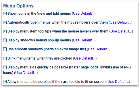
Show icons in the View and Edit menus
When ticked, icons will be shown in the default view and edit menus, but this will obviously require more image files to be loaded from the server when someone first visits your site.
If you want to turn off the icons, un-tick this option.
This option only affects the menuicon macro. If you've turned off icons, you can use the "force=true" parameter on the menuicon macro for any icons you still want to display.
Automatically open menus when the mouse hovers over them
By default, menus will automatically be opened when the mouse hovers over them (like the menus at the top of this page).
If you want to force the user to click a menu to open it's sub-menu, un-tick this option.
This option has no effect on menu performance.
Display menu item tool tips when the mouse hovers over them
By default, any tooltips defined in your menu notation will be shown when hovering over items in the menus.
To turn off tooltips, un-tick this option. This will not have any noticeable effect on performance.
Display shadows behind pop-up menus
When pop-up menus are shown, they will have a drop-shadow behind them by default. The shadow helps "lift" the menu off the page visually and makes it more distinct from surrounding page content.
If you don't want shadows, un-tick this option. This will also give a very small performance increase.
Use smooth shadows (loads an extra image file)
Note: This option is only available if shadows are shown behind menus (see option above).
On browsers which support it, this option makes the shadows behind menus look smoother, but requires an extra image file to be loaded from the server.
If you don't want smoother menu shadows (the difference is barely noticeable on most browsers), un-tick this option.
Blink menu items when they are clicked
Normally, when you click a menu item the browser will immediately navigate to that page.
You can tick this option to make clicked items "blink" a few times before the browser navigates to a page. This gives additional "tactile" feedback to the end-user and does not have any impact on performance.
Display menus as quickly as possible (faster page loads, inhibits use of PNG icons)
Normally, all menus are rendered as soon as the page loads - for small menus, this is fine, but for larger menus it will make pages appear to load more slowly.
When you tick this option you instruct the menu system to only render menus on an as-needed basis. This means that only the menu bar, for example, will initially be rendered and any sub-menus will only be rendered when they are needed.
The key benefit of this option is that it will make pages seem to load more quickly, especially on slow web browsers such as Internet Explorer 7.
The disadvantage is that it prevents the use of PNG icons within the menus. The menuicon macro will automatically search for a GIF version of the icons in this scenario.
Enabling this option is generally recommended if you're experiencing performance issues with the menus.
Allow menus to be scrolled if they are too big to fit on screen
Depending on the number of items in your menus and the end-users' screen size, menus sometimes won't fit on screen making some items on the menus inaccessible.
Generally, we recommend limiting the number of items shown on an individual menu to 10 or less - any more and the user has to spend more time trying to find the option they require.
If you do need to show more options and believe that the list could get big enough not to fit on screen, you can tick this option and menus will resize to the available space and show scroll buttons allowing users to scroll up or down the menu to see additional items.
Note: This option does not currently work in the Opera web browser (normal menus will always be shown to users browsing with Opera).
Menu Shortcut Macros
You can use the in-built viewmenu macro and editmenu macro to quickly add the default View and Edit menus to your menu bars.
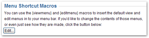
If you want to edit the wiki notation used to create the View and Edit menus, click the "Edit" button to display the editor window:
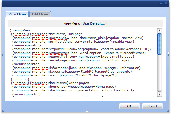
You can quickly switch between the notation for the View and Edit menu using the tabs at the top of the editor window. Once you've finished making changes, click the "OK" button, otherwise click "Cancel".
Note: You don't need to use the viewmenu macro and editmenu macro in your menus - if desired you can copy and paste bits of the menu notation directly in to your own menu.
FAQs
Read Layout Hierarchy to find out 
See Also
- menubar macro - create custom menus anywhere in Confluence
- menuicon macro - displays icons in menus and is affected by settings on the Menu tab
- Menu Performance Tuning - a tutorial on keeping your menus fast
Overview
Community Forums
Content Tools
Apps