Button Hyperlink
The Button Hyperlink macro allows you to create AUI-styled buttons which provide hyperlinks to other pages or websites. These can be added anywhere on a page, or to a Button Group macro to create a button array, like this one.
Although hyperlinks can be created through the standard Confluence interface, the Atlassian-styled button hyperlinks provide stronger visual integration with the application as a whole and can be used to create pages that feel like part of Confluence itself.
You can use the provided styles or further customize the button appearance using our CSS Style Sheet macro.
Instructions
Navigate to the page that you want to edit.
Click Edit.
- Click the location on the page where you want to add the button. This can be repositioned later by dragging the macro placeholder to the desired position. If you are adding it to a Button Group macro, click the Button Group macro placeholder.
Click Insert More Content > Other Macros.
Select the Button Hyperlink macro in the Macro Browser.
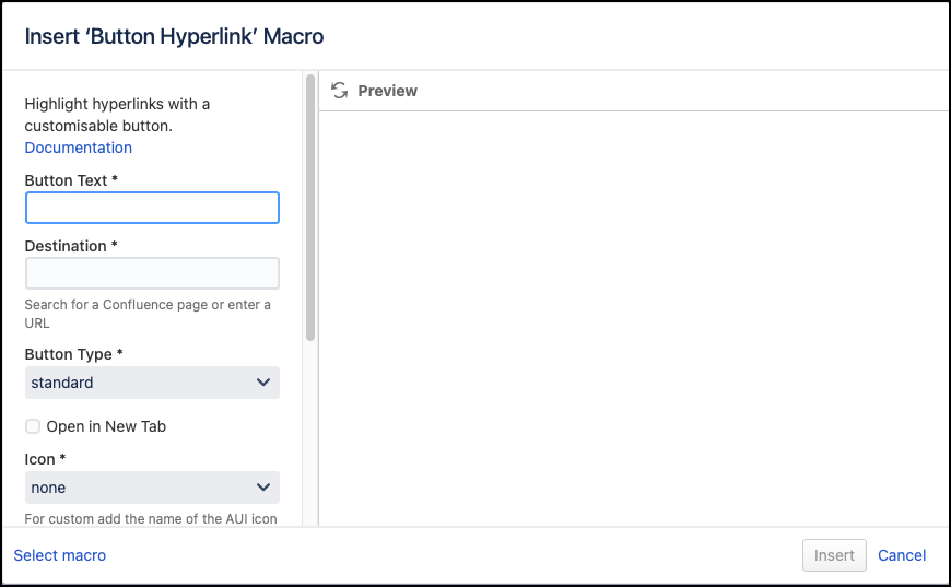
Define the button using the following parameters:
Parameter Description Default Required Button Text
The text that will show on the button
none
Destination
The page, URL or file which the user will be directed to when they click the button.
The field will auto-complete for pages within the Confluence site, but can also take a full URL or file link , e.g.file:///c:/read_me.txt. You may also specify an email destination, e.g.mailto:someone@somewhere.comwhich will launch the default email client when the button is clicked.none
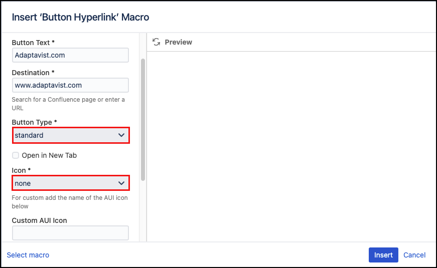
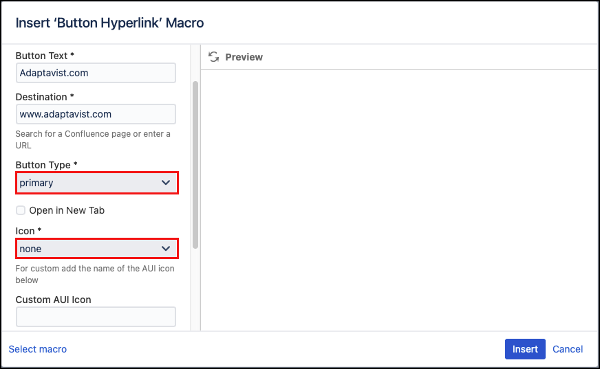
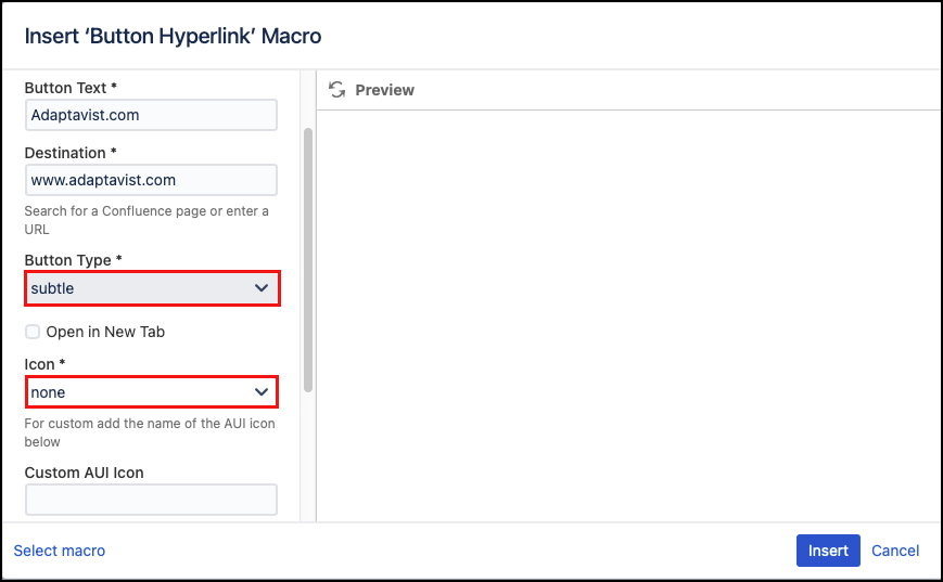
Button Type
Select the button type: Standard, Primary, or Subtle. See Style reference below for examples.
The effect on these buttons will differ depending on whether they are on their own, or a part of a Button Group.
standard
Open in New Tab
Select this option to open the destination page in a new tab.
off
Icon
Select an icon option:
None: no icon is displayed on the button.
Preset: select from a list of Content Formatting icons. See the Icon Reference below.
Custom: select custom to use any AUI icon. See the AUI Icon examples for more information and to verify the correct icon name to enter in the Custom AUI Icon input field.
none
Custom AUI Icon
Add the name of your desired AUI custom icon. The options can be found here, hover over the icon to get the correct name. Available icons are AUI version-dependent.
none
ID
Specify a unique ID for this element. Use this to link to Tooltip, Dialog, or Rollover Macros.
If using this parameter to apply styling to the element, do not include the # selector.none
CSS Class
Use in combination with Global Confluence CSS or a CSS Stylesheet macro that you have added to your page.
Enter the CSS class name(s) to apply to the macro (case sensitive); multiple classes can be separated by a space or comma. Do not include the.selector in the class name.none
Click Insert. A macro placeholder displays.
Save your Confluence page to view the rendered button.
Published Result
Test the link to confirm that it points to the correct destination.
Some browsers may block URL paths that point to files on a local file system or local networked folders for security reasons. This can be overridden in your browser’s security settings, but should only be done as part of a comprehensive security strategy. In most cases, it is best to host such files on dedicated web servers that use other protocols such as FTP. More information can be found in Atlassian’s documentation.
Examples for Style Reference
Icon references
Icons may look slightly different depending on your version of Confluence.


