[All Adaptavist Apps]
Menu Settings
Menu Settings
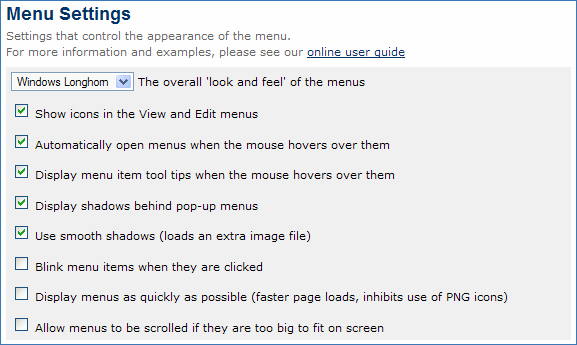
This tutorial shows you how to fine tune the menu system to your specific requirements...The menu settings are accessed from the following panel within the Theme Configuration 1.6.x screen:
Note: The image above shows the default settings and may differ slightly to what you see depending on the settings you have selected.
Each of these settings is discussed below...
Menu Style
Feature Availability: Builder 1.5 and above
This setting defines the look and feel of your menus - for more information, please see our tutorial on Menu Styles.
Advanced Settings
Feature Availability: Builder 1.6 and above
These settings are independant of the menu style selected and enable you to fine tune performance, interaction and other advanced features of the menu system.
Show icons in the View and Edit menus
By default, icons are shown for each item within the in-built view and edit menus. This makes the items in those menus easier to recognise and thus those menus are easier to use:
There are two main scenarios where you might want to remove the icons from the in-built View and Edit menus:
- None of your other menus have icons and you want everything to look consistent
- You want to get maximum performance - removing the icons means less files to download and therefore pages load faster
If you do not want icons to appear in the View and Edit menus, de-select this option which removes the icons as shown below:
Note that the checkbox icons for the "Children" and "Comments" settings at the bottom of the view menu will always be displayed as shown above.
Automatically open menus when the mouse hovers over them
By default, menus will automatically open when the mouse pointer is moved over them. This generally makes it easier to use the menus because users do not need to click items to display their sub-menus.
If you do not want menus to automatically open, de-select this option and users will then have to click menu items to display their sub-menu.
Display menu item tool tips when the mouse hovers over them
By default, tooltips will be displayed when the mouse pointer hovers over a menu item:
Note: Tooltip visualisation depends on your web browser and operating system settings and may differ from that shown above.
If you have not set tooltips, you can gain a small performance boost by de-selecting this option.
For more information on setting tooltips, please see our tutorial on Creating Menus 2.x.
Display shadows behind pop-up menus
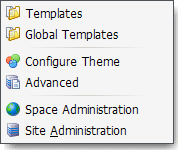
By default, shadows appear behind pop-up menus to giving them a 3D effect to make them look as if they are floating above the page:
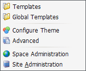
If you do not want shadows, de-select this option. Here's the same menu without shadows:
Removing the shadows will also give a slight performance increase and is also ideal for "ultra-clean" website designs.
Use smooth shadows (loads an extra image file)
Note: This option only appears if you have enabled menu shadows (see above).
By default, shadows are "smoothed" - you can turn this feature off (reducing the number of files loaded from the server) with this option.
Note: This feature is automatically turned off when using Internet Explorer.
Blink menu items when they are clicked
By default, menu items perform any associated action as soon as they are clicked.
Should you want to provide tactile visual feedback to the end-user, select this setting and menu items will quickly "blink" when clicked.
Display menus as quickly as possible
By default, menus will load fully before the menu bar is displayed on the page. This is required to ensure that PNG icons can be used in the menus.
If you want the menus to load as quickly as possible, enable this option. This makes the main menu bar appear much faster, because it doesn't have to wait for all the pop-up menus and sub-menus to load.
The only notable downside to this faster loading is that you can't use PNG icons in your menus. The icons in the standard View and Edit menus will use slightly degraded GIF images, although most people will never notice.
If you want to use PNG icons in your menus, do not use use this option and enable PNG support.
Allow menus to be scrolled if they are too big to fit on screen
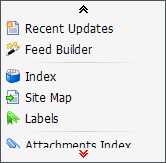
If you have large menus that don't fit on the screen (specifically your web browser window), select this option and big menus will automatically become scrollable:
The menu will only become scrollable if it does not fit in your web browser window, otherwise it will display as normal. This requires a couple of additional image files to be loaded from the server.


