[All Adaptavist Apps]
The selected context is not a valid hierarchical page
As anyone who has ever tried customising the page attachments screen will know, it's a nightmare. I decided to take a look to see what could be done to improve the situation...
The page attachments screen is designed with one theme in mind - the default Confluence theme. It's designed to only work on screen resolutions above 1024x276. As such, if you have a custom theme you'll often end up with this sort of mess (click thumbnail to enlarge):
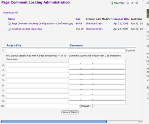
Nasty! Our website theme is fixed to 980px width and also has a sidebar which consumes more screen real estate. The Confluence attachments screen is not designed to work with this scenario.
One major problem here is that the HTML and CSS for the upload section is shockingly bad - rather than using a simple table for the file upload boxes and comments, Confluence is using two <div> elements - one of which is floated to the left of the screen. The various input elements are then output in a list (why?!!) which causes havoc with a screen reader.
There's not much we can do about the accessibility - Atlassian will have to use decent semantic markup to solve that issue (Tip: use a table!), but we can sort out the display glitches.
First, we decided to start with the list of existing attachments - by fixing this we'll also fix the output of the {attachments} macro which suffers the same problem.
It turns out that the CSS to repair the macro is pretty trivial:
table.attachments a,
table.attachments td,
table.attachments th {
  font-size: 10px;
  width: auto;
  white-space: normal;
}
A smaller font helps long filenames and comments take less screen space, and the auto width and normal word wrapping allow the browser to automatically size the table more effectively.
Next, we turn to the upload section - this required quite a bit of fiddling and we've not even tested it on MSIE yet:
.atb-body #viewAttachmentsDiv input {
  width: auto;
}
#upload-files {
  width: 70%;
}
#upload-comments {
  width: 27%;
}
#upload-comments .stepdesc {
  display: none;
}
Again, the end result is pretty simple CSS, but it took lots of experimentation to find the most suitable CSS to use. In particular, due to the really bad HTML structure of the uploads section, we had to hide the ".stepdesc" element (a message about comments not exceeding 255 chars) to get the comments boxes further down the list to line up with their upload boxes.
If the upload section used a table, which in this case is far more semantically correct than a bunch of divs and lists, the issues shown earlier probably wouldn't have arisen in the first place.
So, what did our little CSS hacks achieve - let's take a look:
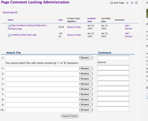
If you're a software developer, don't assume that end-users will be working on full-width layouts on a 30" Apple cinema display. Also, tables are semantically correct in many situations - many web developers seem to be avoiding using tables completely when, in reality, this often results in non-semantic markup for situations like the one described above.