
Use the Button Macro
Create stylized buttons for hyperlinks to other pages or websites.The Button macro allows you to create stylized buttons which provide hyperlinks to other pages or websites. These can be added individually anywhere on a page or grouped as a horizontal row of button links using the Button Group macro.
Although hyperlinks can be created through the standard Confluence interface, buttons provide stronger visual integration with the application as a whole and can be used to create pages that feel like part of Confluence itself.
Add a Button to your page
Navigate to the page you want to edit.
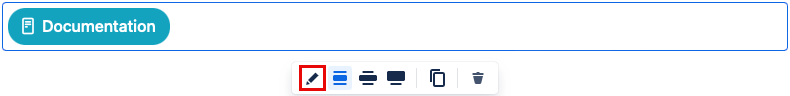
Select the Edit icon.
Select the position where you want to display your cards.
Type /Button and select the Button macro.
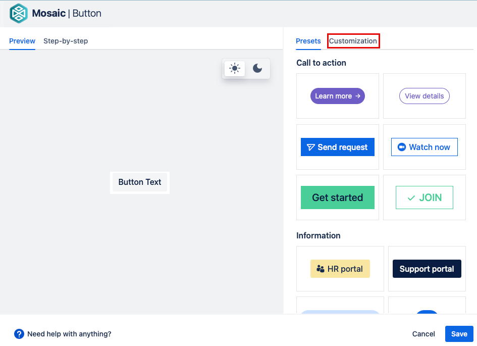
In the button editor:
Select one of the button presets for a quick starting point
Customize your button by changing the appearance, alignment, and destination for your button.
Select Save. A macro placeholder is shown on your page.
Select Publish to see your button in action.
If you are adding multiple buttons you may want to put them in a Button Group macro to keep them neatly arranged in a vertical or horizontal group.
Edit your button
To change the macro, click the macro placeholder, then click the Edit icon.
Make your changes, then select Save.
Add a destination to your Button
You can use a button to link to a Confluence page on your site or to an external webpage.
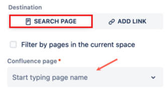
Link to a Confluence page on your site
In the button editor select Search Page, then type in the Confluence page field. The field will search for matching Confluence pages, which you can then select from the drop-down. To only see pages from the same space select the check box above the search box.
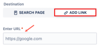
Link to a URL
In the button editor, select Add Link, then type the full web address in the Enter URL field.
For security reasons, some browsers may block URL paths that point to files on a local file system or local networked folders. This can be overridden in your browser’s security settings but should only be done as part of a comprehensive security strategy. In most cases, it is best to host such files on dedicated web servers that use other protocols, such as FTP. More information can be found in Atlassian’s documentation.
Link a button to a specific place on a page
You can combine the button macro with confluence's anchor macro to link to a specific point on a page.
Link to a location on the same page
- Add an anchor macro to the page.
- Give the anchor macro a name eg. notes.
- Use the name of the anchor macro as the Destination for the button macro. Do this by putting #name. eg #notes.
Link to a location on a different page
- Add an anchor macro to the page.
- Give the anchor macro a name eg. notes.
- In the Destination field of the button macro, select the page with your anchor macro. Then, add the name of the anchor to the end of the URL.
eg. sitename.domain/wiki/Project+seven#notes
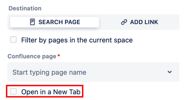
Open a new tab with your Button
If you don't want readers to leave the page when they click on a button, you can make it open a new tab when selected. To do this, select the Open in a New Tab check box.
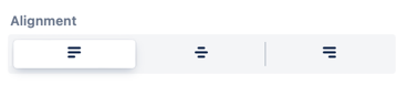
Change the alignment of your Button
There are three options for aligning your button: Left, Centre, and Right. You can select these options in the Button editor.
Change the appearance of your Button
There are two ways to change the appearance of your button. You can use one of the preset button types to quickly change your button style and get a new look and feel. Or you can design it yourself using the Customization tab.
If you use one of the preset options you can still customize it to suit your needs.
Change your Button text
Changing the text on your button is easy. Simply select the Button text field and enter the text for you need. If you don't want any text you can choose to only have an icon instead.
Add an icon to your Button
You can add an icon or emoji to your button to help show what it is for and to add some personality to your buttons. To add an icon select Add icon from the editor.

This opens the icon and emojis libraries. You can select any icon from the libraries.
You can change an icon after adding it to a Button. Select the pencil icon to choose a different icon. Select the trash icon to remove it.
Change icon position
The icon position parameter lets you choose where the icon will appear. The options are:
| Before | After | Only |
|---|---|---|
|
|
|
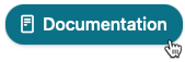
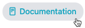
Choose a Button style
There are four different styles to choose from. Each button style has its own hover state to highlight the button before a user clicks on it. The style options are:
| Filled | Bordered | Subtle | Link | |
|---|---|---|---|---|
Normal |
|
|
|
|
| Hover |
|
|
|
|

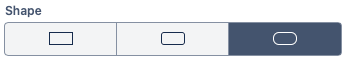
Change your Button shape
There are three options for how rounded your button is. Select your choice from the Shape field.
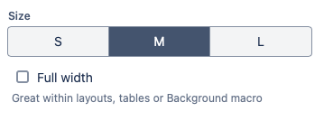
Change your Button size
Choose from Small, Medium, and Large for your button size.
Select the Full Width checkbox to make the button fill the full width of the space it is in. This is a good option when using buttons inside a table or Background macro.
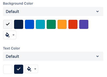
Change your Button color
Using color palettes, you can customize the color of the background and text to be exactly what you want. You can select from one of the options shown. If you don't see the color you want, select the Paint bucket button to open a color picker and choose any color.
Changing the color palette will change the presented options.
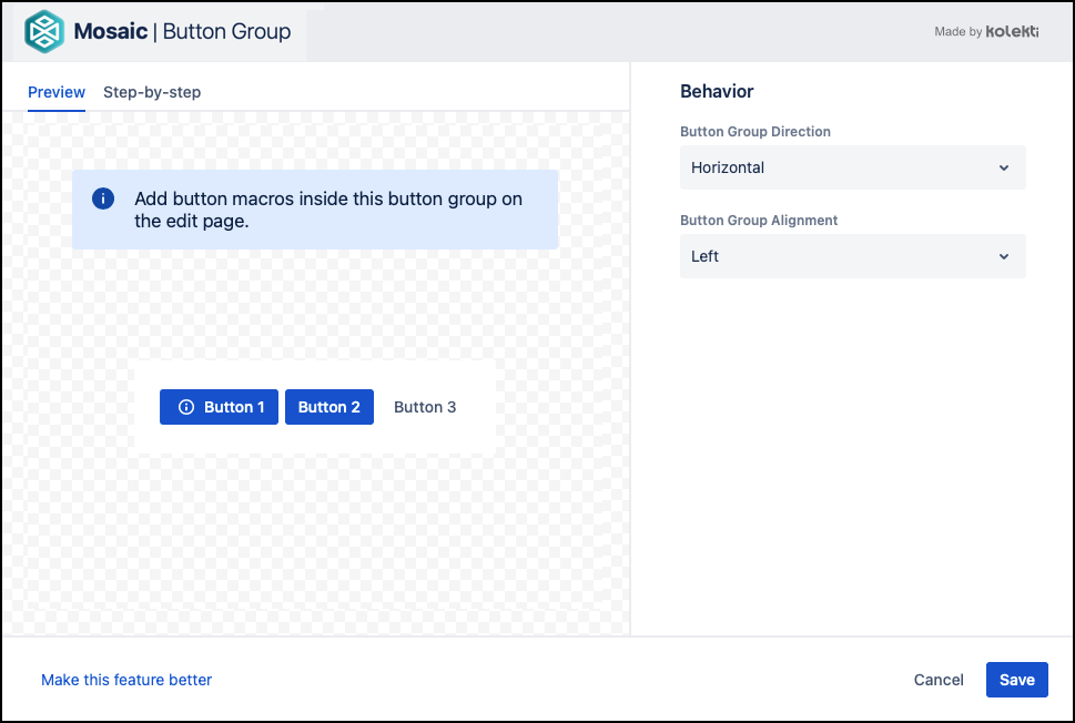
Button Group Macro
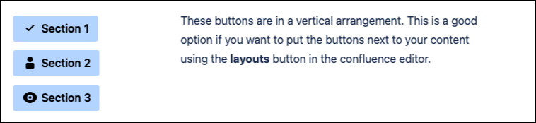
Used in conjunction with the Button macro, the Button Group macro allows you to create stylized button groups. You can create a horizontal toolbar-like group of hyperlinks or a vertical page tree-like group.
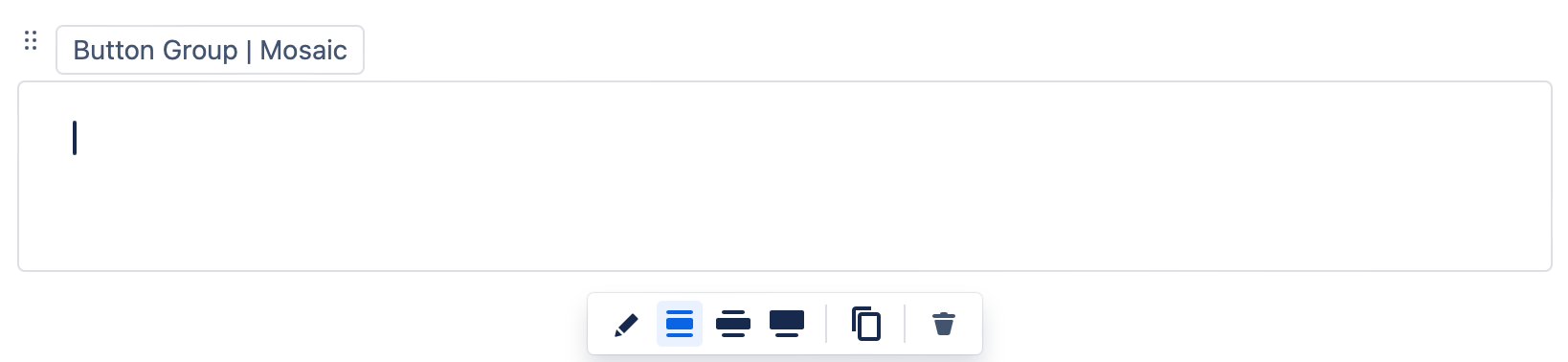
Add a Button Group macro to your page
Navigate to the page that you want to edit.
Click the Edit icon.
Click Insert > View More in the Confluence editor.
Select the Button Group macro in the Select Macro screen.
Choose the direction of the buttons from the Button Group Direction dropdown. They can be Vertical or Horizontal. The default is horizontal.
Choose your preferred Button Group Alignment. They can be Left, Centre, or Right. The default is Left.
A macro placeholder is displayed.
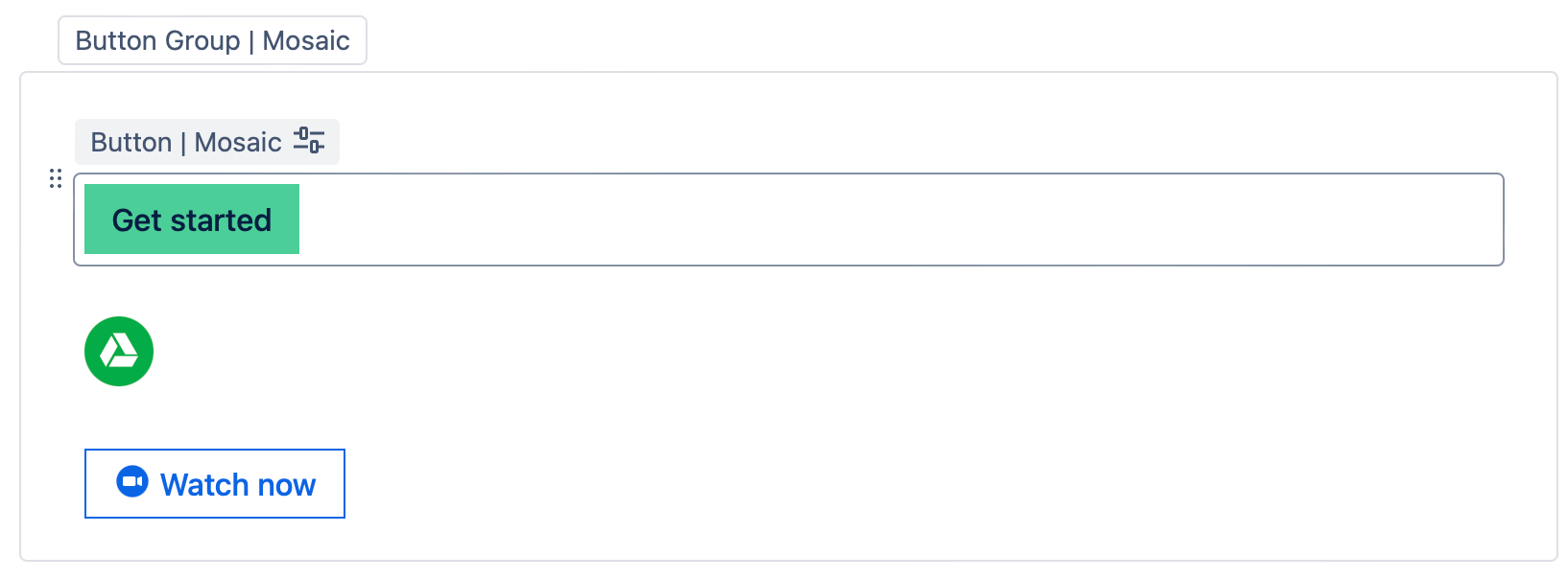
Insert a Button macro for each button you want to add into the macro placeholder, e.g. add a Button macro for Email, Search, and Edit. Buttons are arranged in the order shown within the Button Group macro. You can change the order later by dragging the macro placeholders to the desired positions.
Click Publish to view the Button Group rendered with the button links. In the example below, standard, primary, and subtle style buttons were added to the Button Group.
Click the buttons to test the link destinations and behaviors, e.g. if they open in a new tab.

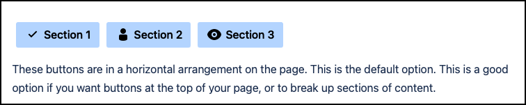
Direction Examples
Horizontal Direction
Vertical Arrangement
Edit the macro
To make changes to the macro, for example, to add or remove a button or to change the tooltip text, click the Button Group macro placeholder then click the Edit icon. Make the required changes, the changes save automatically.