[All Adaptavist Apps]
Page History
Theme Configuration for Builder 2.x
Use the visual theme editor to quickly customise Confluence...Excerpt
Introducing Theme config
The theme configuration screen allows you to manipulate the look and feel of the Builder theme to suit your needs, you can use it to easily add and remove panels, change colours, fonts & background images and even add new functionality to confluence.
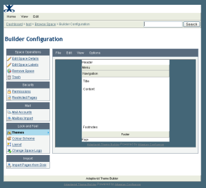
The theme configuration screen can be split into two main areas the layout editor is the screen you see when first can be seen on entering theme configuration and the panel editor is the screen that appears when you click on one of the panels in the layout editor.
...
Above the panel editor there is a similar menu which is used for making changes to the panel selected either through the Edit menu or by clicking on it in the layout editor. The panel editor allows you to change a multitude of settings that affect the look of the individual panel from background colours & images to border styles and even selecting font types and sizes. More on that later though, for now lets dive in and get making some changes!
Changing the layout
The first step in configuring the Builder theme is to choose the panels that you need to be visible. Builder currently offers nine panels to choose from, the arrangement of these panels mean that pretty much any layouts desired can be achieved by judicious choice of which panels are visible.
...
For now, let's switch on the left sidebar, and switch off the left slider since later on we are going to move the menubar from the menu area into the left sidebar and we dont really want users sliding the menu out of view as it can lead to confusion!
Changing the look
When you click on a panel in the layout editor (or select it through the edit menu) the panel style editor appears below the layout editor.
...
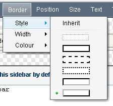
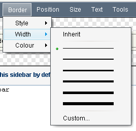
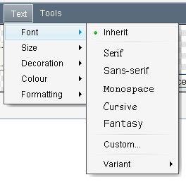
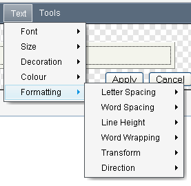
The panel editor provides control over the full range of css options from setting background colours and images to the panel border width & style, through the Border->Style and Border->Width menu, the font used within a panel can be set using the Text->Font menu along with all manner of text-layout options found in the Text->Formatting menu.
| Section | ||||||||||||
|---|---|---|---|---|---|---|---|---|---|---|---|---|
|
| Section | ||||||||||||
|---|---|---|---|---|---|---|---|---|---|---|---|---|
|
Each time you make a change the result will be displayed in the panel style editor, once you are happy with the changes you have made to the panel the settings then need to be applied to the layout editor before moving onto the next panel using the apply button in the lower right of the panel editor.
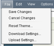 To view the panel settings applied to the whole theme, you will need to save your changes back to the server using the File->Save Changes menu option. When you are finished with updating the theme configuration, then it is highly recommended that you save a backup copy of your theme configuration using the File->Download Settings option. This backup is most useful for those times when you are trying out new styles and need to refer back to older versions you were happy with.
Changing the feel
Probably the most often requested feature from Builder 1.x users was the ability to put wiki markup into the header area. With Builder 2.0 we took this request to it's final conclusion and have made every panel definable using wiki markup, including taking all of the features of the confluence page and blogpost view screens and converting them to macros so that they can be added or removed by editing the markup for the panel that contains them.
...
Overview
Community Forums
Content Tools
Apps