[All Adaptavist Apps]
This information is for ThemeBuilder on Confluence 4 or lower. Go to the documentation for ThemeBuilder on Confluence 5+
Customising the Search button
This tutorial explains how to customise the search box using CSS, eg. adding a graphical search button...
Adding a Search Box
The search box macro is part of Adaptavist's open source "Content Formatting Macros" plugin:
{search-box}
It appears top-right (most common place for a search box) on almost every theme but can easily be moved to other panels or even put in to page content.
Using CSS, it's possible to customise the search box, such as adding a graphical search button. Here's an example:
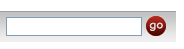
Image
First, you'll need the graphical image, for example: 
Wherever possible, use a GIF or JPG image - it's going to be a background image meaning that Internet Exploder versions earlier than 7.0 won't display transparency properly (even with our PNG fix script because it only looks at <img> tags).
If you do use a PNG then you'll have to use the MSIE proprietary alpha transparency filter in your CSS (I'll leave you to google for more info on that to deter you using it  ).
).
If the site doesn't allow anonymous access, remember that images attached to pages won't be available to logged out users (eg. on login, forgot password and sign-out screens) so you might need the image placing in the /images folder on disk or find some other location for it.
CSS
The CSS is pretty simple, we just add something like this to the Custom CSS option on the CSS Tab:
/* search box */
#quick-search-submit,
.searchButton {
 border-style: none;
 text-indent: -10000px;
 overflow: hidden;
 background: transparent url(/download/attachments/2261005/go.jpg) no-repeat scroll top left;
 width: 20px;
 height: 20px;
 cursor: pointer;
}
Note: This CSS is applicable to the search dialog output by either the builder-show or search-box macros. If you're using some other macro to display a search box, you might need to change the CSS to adapt it to the HTML output by that macro.
When any CSS is applied to a HTML form element, the browser takes over its rendering giving you far more control.
The CSS above does the following:
- removes border
- hides the text (by adding a negative indent and hiding the overflow)
- removes the default background color and applies an image background instead
- Sets a fixed width and height (same dimensions as the image)
- Displays a pointer cursor when the mouse is over the button (so user knows it's clickable)
You'll notice that a relative URL has been used - this is of critical importance as most sites (including 100% of sites we host for customers) can be accessed from multiple URLs and cross-domain security will prevent background images (depending on browser and config) if they are from a different domain.
If you're using CSS sprites, remember to set the pixel value position of the relevant sprite on the background style.
Using Builder Icon Resources
If the customer is using Theme Builder 3.0.3 or above, you can use any of Builder's icon resources in the CSS, with an un-documented feature:
background: transparent url(%ICONPATH%/view.png) no-repeat scroll center center;
 It's possible the
 %ICONPATH% property will get renamed to something that's more in-line with naming conventions used elsewhere in the plugin so check release notes on any future upgrades.
Overview
Community Forums
Content Tools
Apps
2 Comments
Unknown User (dannyzen)
This does not seem to be applicable to the builder-search macro.
What CSS would needed to be edited to modify this search engine, as it uses the auto-fill abilities.
Looking for instructions on creating a search very similar to the adaptavist site.
Unknown User (gfraser)
Updated the CSS in the tutorial to apply to the button on the builder-search macro as well.
If you want to customise the drop-down suggestions menu that appears on the builder-search macro, use something like this:
#quick-nav-drop-down {
  the css here will customise the drop-down panel
}
#quick-nav-drop-down li {
  the css here will customise items in the drop-down panel
}