Use the Macro
This macro can contain content within a box with rounded corners. Content can include paragraph text, plain text, and bodiless macros. These either have no additional text content area or allow only plain text without formatting such as color, special fonts, or attributes such as italics. The rectangle size, corners, and colors are configurable.
Instructions
Navigate to the page you want to edit.
Click the Edit icon.
Click Insert > View More.
Select the Round Rectangle macro in the Select Macro screen.
Customize the rectangle using the following parameters:
Parameter Description Default Required Title
Displays content in the space above the main content area between the upper corners
none

Footer
Displays content in the space below the main content area between the lower corners
none
Background Color
The background color of the content area.
You can specify the hexidecimal code, e.g. #60dbdb or a common generic color such 'blue', 'green', etc.#C0FFC0 (Granny Apple green)
Title Background Color
The background color of the title area (defaults to the same color Background Color); specify the hexidecimal code, e.g. #60dbdb or a common generic color such 'blue', 'green', etc.
fits to contents
Footer Background Color
The background color of the footer area (defaults to the same color as Background Color); specify the hexidecimal code, e.g. #60dbdb or a common generic color such 'blue', 'green', etc.
fits to contents
Corner size
The radius, in pixels, of the round rectangle corners. This sets the defaults for the Horizontal Size and Vertical Size parameters below
25px
Horizontal size
This parameter, which defaults to the value defined by Corner Size, defines the height of the panel corner
25px
Vertical size
This parameter, which defaults to the value defined by Corner Size, defines the width of the panel corners
25px
Height
The height of the entire round rectangle; you can use pixel size (eg 200px), percentage (50%) or leave it blank to dynamically fit contents.
background color
Width
The width of the entire round rectangle; you can use pixel size (eg 500px), percentage (70%) or leave it blank to dynamically fit contents.
background color
Rounded Corners
A list of which corners should be rounded: Top Left, Top Right, Bottom Left, and Bottom Right
true,true,true,true
Rows
A list of which rows should be displayed: Top, Middle, Bottom
true,true,true
Click Save. A macro placeholder is displayed on the page.
- On the edit page put your content inside the macro placeholder.
Click Publish to see the round rectangle rendered on the page.
Examples
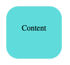
Setting the background color
You can assign any hexadecimal color value or common color name such as 'green', 'yellow', 'blue', etc. The background color defined sets the default background color for Title Background and Footer Background.
Default Height and Width; Background Color set to hexadecimal value #60dbdb.
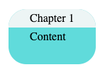
Adding titles
Text may be added to the title area (above the main content area, between the two rounded corners). You can define a different background color for the title area.
Title set to 'Chapter 1' and Title Background Color set to #edf5f5.
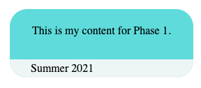
Adding Footers
Text may be added to the footer area (below the main content area, between the two rounded corners). You can define a different background color for the footer area. Note how the rectangle default size expands to fit contents.
Footer set to 'Summer 2021' and Footer Background Color set to #edf5f5.
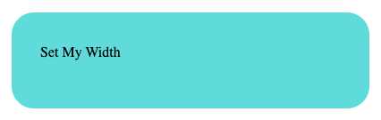
Setting width
The width of the round rectangle may be defined in pixels or a percentage.
Background Color set to #edf5f5 and Width set to 400px.
Setting height
The height of the round rectangle may be defined in pixels or a percentage.
Background Color set to #edf5f5 and Height set to 170px.
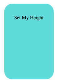
If the content is too large to fit, the round rectangle will expand to fit.
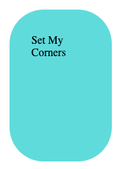
Setting corner size
The radius of the curved corners is defined using the Corner size property.
Background Color parameter set to hexadecimal value #edf5f53, Corner Size set to 10px.

Background Color set to #edf5f5 and Corner Size set to 50px.