[All Adaptavist Apps]
Page History
Use the visual theme editor to quickly customise Confluence...Excerpt
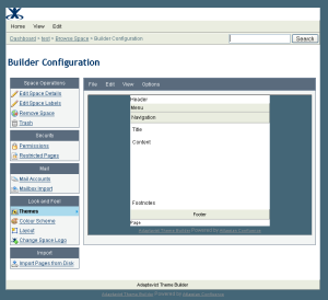
Introducing Theme config
The theme configuration screen allows you to manipulate the look and feel of the Builder theme to suit your needs, you can use it to easily add and remove panels, change colours, fonts & background images and even add new functionality to confluence.
The theme configuration screen can be split into two main areas the layout editor is can be seen on entering theme configuration and the panel editor is the screen that appears when you click on one of the panels in the layout editor.
The menu above the layout editor is used for making changes to the theme as a whole, switching panels on or off, making changes to the default menu style, hiding parts of the breadcrumb trail etc..
Above the panel editor there is a similar menu which is used for making changes to the panel selected either through the Edit menu or by clicking on it in the layout editor. The panel editor allows you to change a multitude of settings that affect the look of the individual panel from background colours & images to border styles and even selecting font types and sizes.
Changing the layout
The first step in configuring the Builder theme is to choose the panels that you need to be visible. Builder currently offers nine panels to choose from, the arrangement of these panels mean that pretty much any layouts desired can be achieved by judicious choice of which panels are visible.
If you are unsure as to which panels would be a good choice for your chosen layout then please contact us with a jpeg or link to the style that you are hoping to create and we can advise which panel arrangements may suit you best.
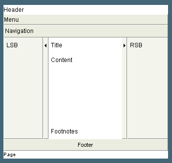
The image above shows the layout editor when all of the available panels have been switched on, you do not have to use all of the panels, in some cases you may wish for only one panel to be visible, however the Builder theme offers you the flexibililty to choose the layout you need.
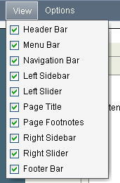 You can select which panels are visible and which are not using the View menu from the menubar above the layout editor, a panel is hidden by unchecking the box next to it and displayed by checking the box.
When a panel is made invisible the structure of the document changes and adjusts so that to the end user it would appear that the panel were never there in the first place! This is a philosophy that is followed throuought the theme, rather than just hiding the chunk of HTML that would normally display the panel, the HTML is removed so that the end user doesnt have to download any more data than they really need to!
For now, let's switch on the left sidebar, and switch off the left slider since later on we are going to move the menubar from the menu area into the left sidebar and we dont really want users sliding the menu out of view as it can lead to confusion!
Changing the look
When you click on a panel in the layout editor (or select it through the edit menu) the panel style editor appears below the layout editor.
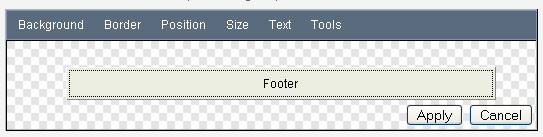
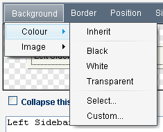
One very frequently used parameter is the background colour of the panel, this can be selected in several ways, the most basic of which is by using the Background->Colour->Custom menu option to bring up a dialog box that allows you to enter the hex value of the colour you desire.
Alternativley you can choose the preset Black or White colours, or even the very frequently used Transparent option that lets the colour of the page show through. This is most useful when you are using a background image applied to the page and want it to show through the other panels. The 'inherit' option allows you to have the colour chosen for the page applied automatically to the selected panel, this often gives a very similar effect to the 'transparent' option however if you are using a background image this will not show through the inherited colour.
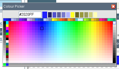 If you don't already know the hex value of the colour you want or just feel the need to browse until you hit upon a colour then you can bring up the inbuilt colour picker by selecting the Background->Colour->Select menu option.
The grey boxes down the right hand side of the colour picker control the overall brightness, of the centre section which is arranged so that the colour is defined by the horizontal position of the colour cell, while the vertical defines the saturation, the columns of colurs down the left hand side are pre-set colours and the band of colours across the top display complimentary and contrasting colours to the current selection. The bottom row of the picker displays a history of recently chosen colours.
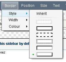
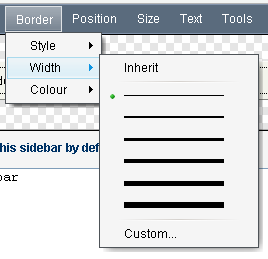
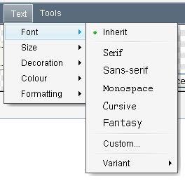
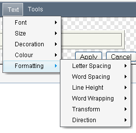
The panel editor provides control over the full range of css options from setting background colours and images to the panel border width & style, through the Border->Style and Border->Width menu, the font used within a panel can be set using the Text->Font menu along with all manner of text-layout options found in the Text->Formatting menu.
| Section | ||||||||
|---|---|---|---|---|---|---|---|---|
|
| Section | ||||||||
|---|---|---|---|---|---|---|---|---|
|
Each time you make a change the result will be displayed in the panel style editor, once you are happy with the changes you have made to the panel the settings then need to be applied to the layout editor before moving onto the next panel using the apply button in the lower right of the panel editor.
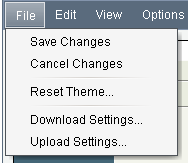 To view the panel settings applied to the whole theme, you will need to save your changes back to the server using the File->Save Changes menu option. When you are finished with updating the theme configuration, then it is highly recommended that you save a backup copy of your theme configuration using the File->Download Settings option. This backup is most useful for those times when you are trying out new styles and need to refer back to older versions you were happy with.
Changing the feel
Probably the most often requested feature from Builder 1.x users was the ability to put wiki markup into the header area. With Builder 2.0 we took this request to it's final conclusion and have made every panel definable using wiki markup, including taking all of the features of the confluence page and blogpost view screens and converting them to macros so that they can be added or removed by editing the markup for the panel that contains them.
For instance, to completely remove the comment display and editor from all pages you will need to click on the page footnotes panel, scroll down past the panel editor to the text input box that contains the markup that is used to populate the footnotes panel and remove the {builder-comments} macro from that box.
Similarly the {builder-children} macro that outputs the confluence children display could be moved from the footnotes area over into the right sidebar, we would probably also want to hide the right-sidebar by default so that the children display is still accessable but doesnt take over too much of the screen display.
To do this you would first remove the builder-children macro from the footnotes area, then enable both the right sidebar and slider, then enter {builder-children} into the right sidebar and check the 'collapse this sidebar by default' checkbox.
This procedure can be used to move any of the screen elements about, the menus may be moved from their default location to any of the panels, often panels are used merely to position the content or contain background images used to frame the page.
Overview
Community Forums
Content Tools
Apps