
Lozenge
The Lozenge macro creates a lozenge button with an optional link that's ideal for highlighting important information or directing users to additional resources. It is designed for small amounts of content (although the width can be changed to accommodate more content if required). This is to ensure that the content contained within the lozenge is concise and, in turn, leads to an improved user experience.

Instructions
- Navigate to the page you want to edit.
- Click Edit.
- Click the position where you want to add a lozenge. This can be repositioned later if required.
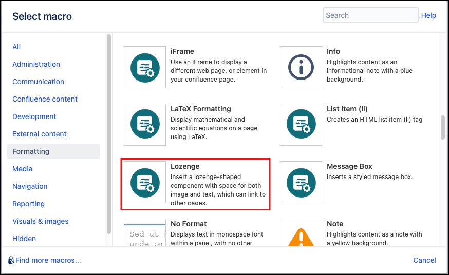
- Click Insert More Content > Other Macros.
- Select the Lozenge macro from the Macro Browser.
Customize the macro using the following parameters:
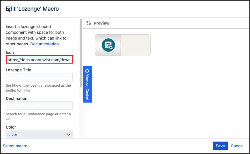
Parameter Description Type Default Required Icon
The URL for an image (no larger than 48x48 pixels) or simply type in text to use as a label.
string
none

Title
Enter the title of the lozenge, also used as the tooltip for links.
string
none
Destination
The page, URL, or file to which the user will be directed when they click the button.
The field will auto-complete for pages within the Confluence site, but can also take a full URL or file link , e.g.file:///c:/read_me.txt. You may also specify an email destination, e.g.mailto:someone@somewhere.comwhich will launch the default email client when the button is clicked.string
none
Color
Select the color of the left portion of the lozenge.
single select
silver
Arrow
Select the arrow to use on the left portion of the lozenge:
none: (default if no link is specified)
blue: (default if a link is specified) - a blue arrow is displayed
green: a green arrow is displayed
single select
none, or blue
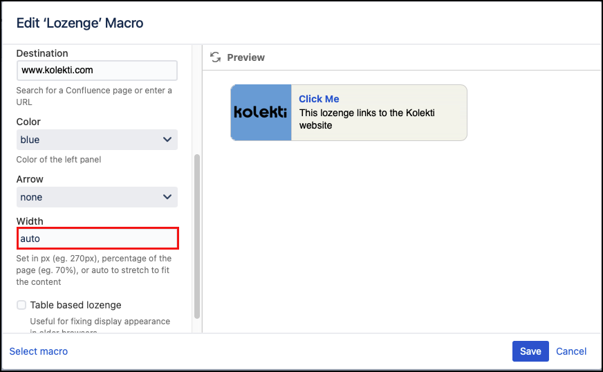
Width
Define the width of the entire lozenge in pixels or %. Specify auto to automatically stretch the lozenge to fit its contents.
string
none
Table based lozenge
Compatibility setting for use if the lozenge does not display correctly in older browsers.
checkbox
unselected
- Click Insert. The macro placeholder displays.
- Enter the text to display in the macro body, e.g. a description, summary text, or add an Excerpt Include macro.
Save the page to view the rendered lozenge.
Published Result
Test any defined links.
Page or URL parameter: If the defined URL or Confluence page does not exist, a new child page is created when the lozenge is first clicked using the value supplied in the "Page or URL" parameter. On subsequent clicks, Confluence will navigate to the created page. To ensure the link goes to an external webpage put 'https://' in front of the URL
Colors
There are nine colors to choose from for the left section of the lozenge, and two colors for the arrow.
| Color | No Arrow | Blue Arrow | Green Arrow |
|---|---|---|---|
bronze |
|
|
|
silver |
|
|
|
gold |
|
|
|
blue |
|
|
|
cyan |
|
|
|
green |
|
|
|
purple |
|
|
|
pink |
|
|
|
red |
|
|
|


Examples
Basic lozenge
Create a simple lozenge as follows:
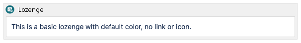
Published Result
Add an Icon
Any images you add are not held within the macro. You need to provide a URL for the image. One way to do this is to add the image to the page as an attachment. You can then use the URL for this image in the Icon field.
The most effective icons are 32x32 or 48x48 pixels and have transparent backgrounds.
Put the URL for your image in the icon field.
Published Result
Add a Label
If you want text to show in the left-hand section you can just input that text into the Icon field.
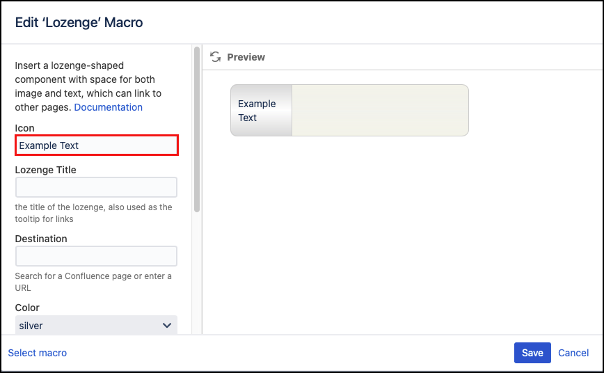
Published Result
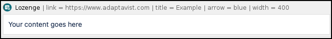
Lozenge Links
When a link is added to the lozenge, it displays a blue arrow by default:
Published Result
The title is linked so that browsers with JavaScript disabled can still follow the link. If a title is not specified, the link will disappear so browsers without JavaScript won’t be able to follow the link.
If you want a different color arrow or no arrow, select the option you want from the Arrow field.
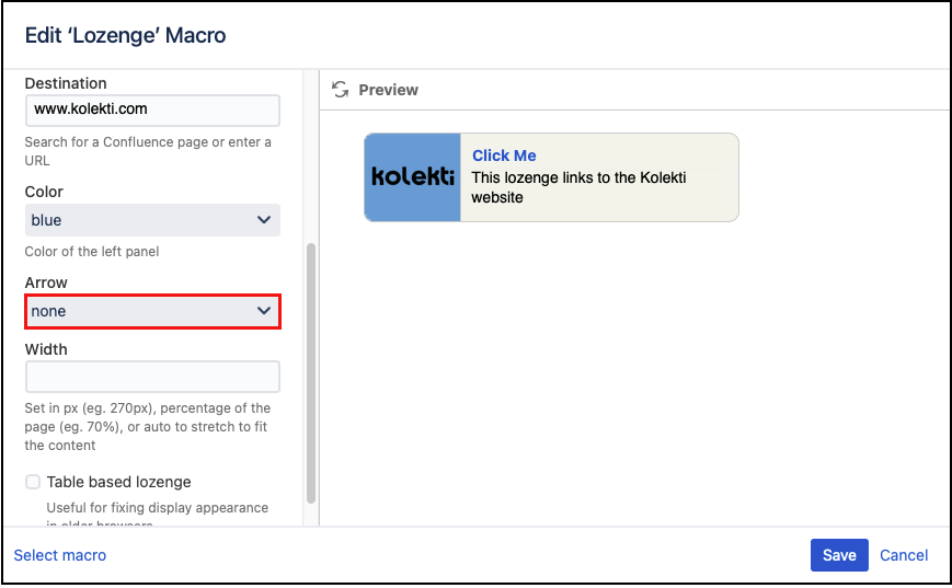
Published Result

Lozenge Width
By default, all lozenges are 347px wide. However, they can be stretched to fit their contents.
For a lozenge that changes size to match the size of the content and the webpage type auto into the Width field.
Published Result
You can also set a percentage width, for example, 70%:
Published Result
Or, a pixel width, for example 200px:
Published Result