
Button Group
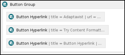
The Button Group macro is designed to be used with your Button Hyperlink macros. It acts as a container for buttons when you want to display them in an array such as a toolbar-type menu like this one. You can customize the Button Group by combining it with our CSS Style Sheet macro.
Instructions
- Navigate to the page you want to edit.
- Click Edit.
- Click the location on the page where you want to add the button group. This can be repositioned later by dragging the macro placeholder to the desired position.
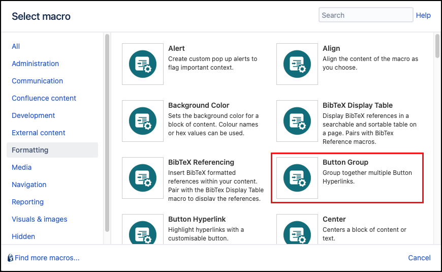
- Click Insert More Content > Other Macros.
- Select the Button Group macro from the Macro Browser.
Add any optional customization using the following parameters:
Parameter Description Type Default Required Text Shown on Hover
Enter text that displays as a tooltip to users on hover.
string
none

CSS Class
Use in combination with Global Confluence CSS or a CSS Stylesheet macro that you have added to your page.
Enter the CSS class name(s) to apply to the macro (case sensitive); multiple classes can be separated by a space or comma. Do not include the.selector in the class name.string
none
ID
Specify a unique ID for this element. Use this to link to Tooltip, Dialog, or Rollover Macros.
If using this parameter to apply styling to the element, do not include the # selector.string
none
Click Insert. The macro placeholder displays.
Add the Button Hyperlink macros inside your button group as required. They will be rendered in the order in which they are positioned in the placeholder.
Save the page to view the rendered buttons.
Example of Published Button Group
Test the links to confirm that they point to the correct destination.